
Selected Work
MyHealthfinder: Turning a Federal Tool Into a Plain Language Success Story
U.S. Department of Health and Human Services (ODPHP)
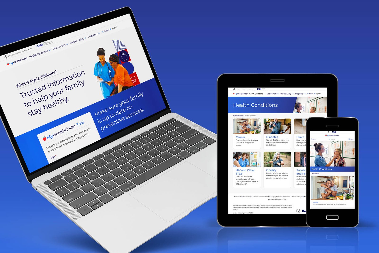
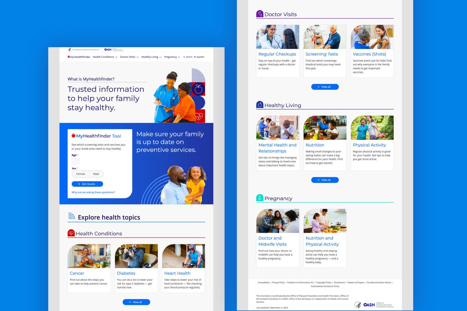
The Challenge
MyHealthfinder is a federal tool that helps users find personalized preventive health recommendations. But its results page was confusing, dense, and hard to act on, even for health-literate users.
The Shift We Made
We redesigned the assessment results to be clearer, more personalized, and more actionable, using plain language principles and accessible layouts to bring the tool in line with user needs.
How We Did It
- Led creative overhaul of MyHealthfinder’s visual system
- Reorganized information hierarchy for clarity and priority-based action
- Applied health literacy best practices, plain language edits, and 508/WCAG compliance checks
- Created multiple content layouts tested for screen-readability and mobile use
04 / What Happened Next
What Happened Next
Winner of the ClearMark Award – Digital: Best Before & After
Judges noted the redesign’s “clear focus on providing actionable information”
Became a showcase for user-centered design in federal digital health tools
Why It Mattered
It made preventive care easier to understand, and even easier to act on.