
Brand Applications
Giving Donors a Clearer View of the Mission
01 / The Challenge
The Challenge
Founded in 1963, Big Brothers Big Sisters of Central Mass & MetroWest has spent decades building one-to-one mentoring relationships between local young people and adult volunteers. Those relationships are supported by staff, training, screening, events, and ongoing match support, all of which depend heavily on community giving.
The organization needed fundraising and reporting materials that could communicate needs, accomplishments, and growth without allowing the administrative side of the story to eclipse the children and relationships behind it.
02 / The Shift
The Shift We Made
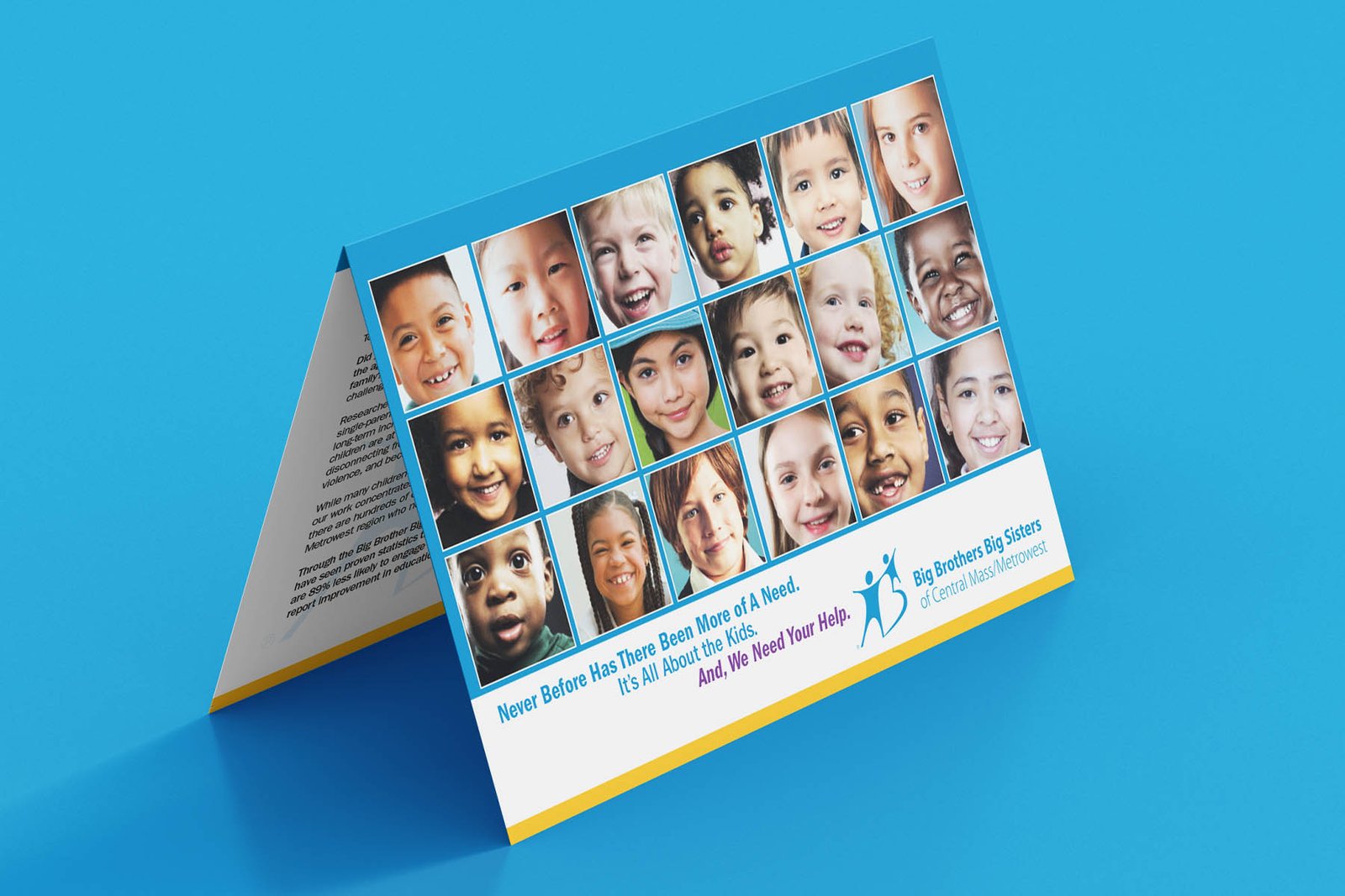
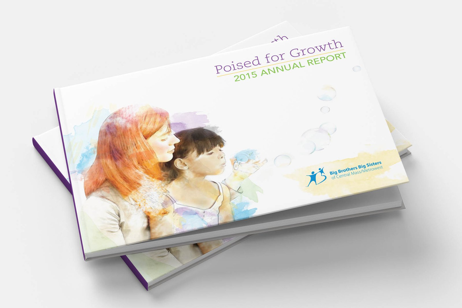
We put people back at the center. The fundraising package used children’s faces to create an immediate human connection, while the annual report paired organizational information with a more personal visual story of participation and growth.
03 / The Work
How We Did It
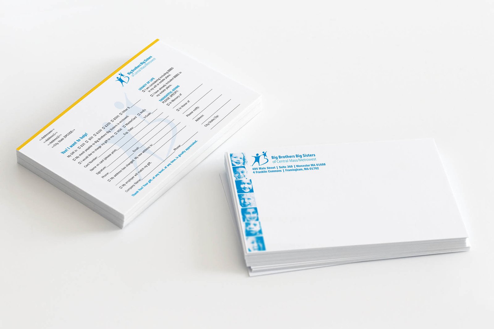
- Designed a coordinated fundraising package with appeal materials, envelopes, and response pieces
- Built the donor campaign around a mosaic of children’s portraits rather than institutional imagery
- Designed the Poised for Growth annual report around program stories, milestones, sponsors, and community activity
- Created layouts that could carry financial and organizational information without becoming visually bureaucratic
- Kept the two efforts distinct while preserving the optimistic, youth-focused character of the organization
04 / What Happened Next
What Happened Next
05 / Why It Mattered
Why It Mattered
Donors need to understand both sides of a nonprofit story: what the organization is accomplishing and who their support ultimately reaches. These pieces gave Big Brothers Big Sisters room to show both.