
Brand Applications
Billboard Design at 55 MPH
Process Highlight
Brand Applications
Billboards are one of the most unforgiving things to design. There is no scroll, no second paragraph, and usually only a few seconds to get the point across.
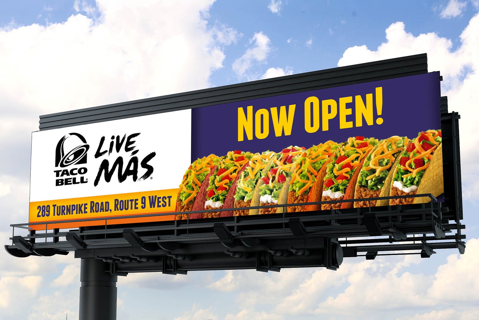
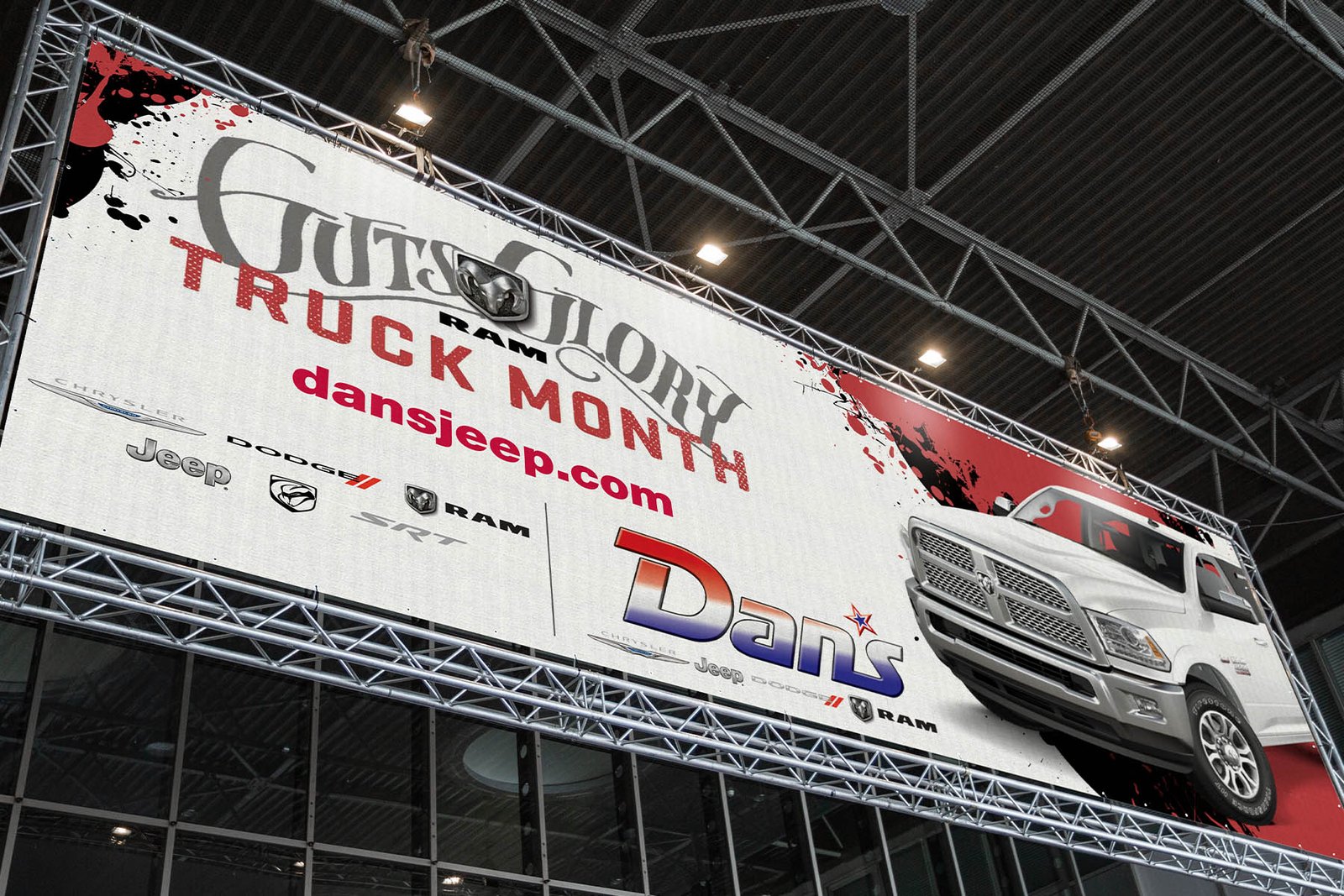
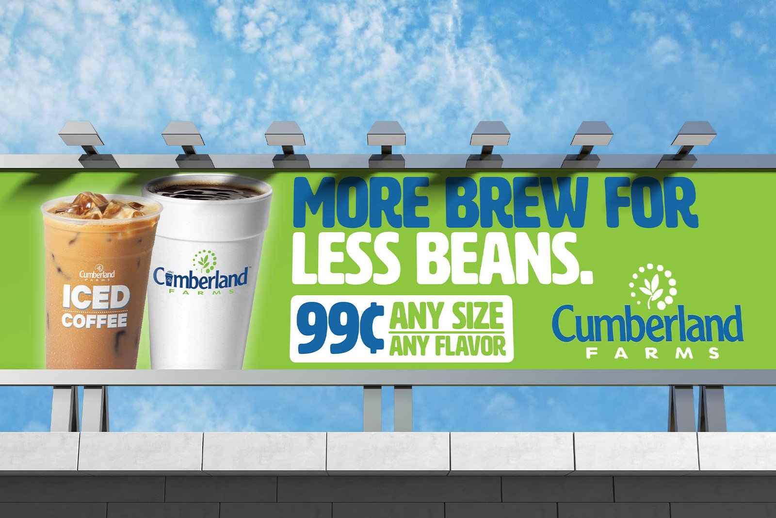
The examples come from unrelated assignments in automotive, convenience retail, and quick-service restaurants. The brands have almost nothing in common. The design problem does: decide what matters most, then make sure it still works from across the road.
01 / My Process
My Process
Find the one thing
I start by reducing the brief to what someone actually needs to remember after passing the board. If everything is important, the hierarchy has already failed.
Design from the road
Type that feels enormous on a monitor can disappear at viewing distance. Image scale, contrast, logo placement, and negative space all get judged by how the board will actually be encountered.
Decide what the eye sees first
Sometimes that is the offer. Sometimes it is a truck, a cup of coffee, or a row of tacos. Whatever carries the idea gets the strongest position, and everything else has to support it.
Edit harder than usual
I shrink the artwork, step away from it, and look again. If a detail takes too long to understand, it is probably not earning its space.
Work backward from production
Board proportions, output resolution, trim, lighting, placement, and viewing angle can all affect the composition. I want those realities in the process early enough to influence the design rather than simply constrain it at the end.
02 / Why It Matters
Why It Matters
These boards sold very different things, but each depended on the same discipline. The idea had to register quickly, feel like the brand, and leave something behind after the viewer had already driven past.