
Brand Systems
Massachusetts Health Connector Brand Refresh
01 / The Challenge
The Challenge
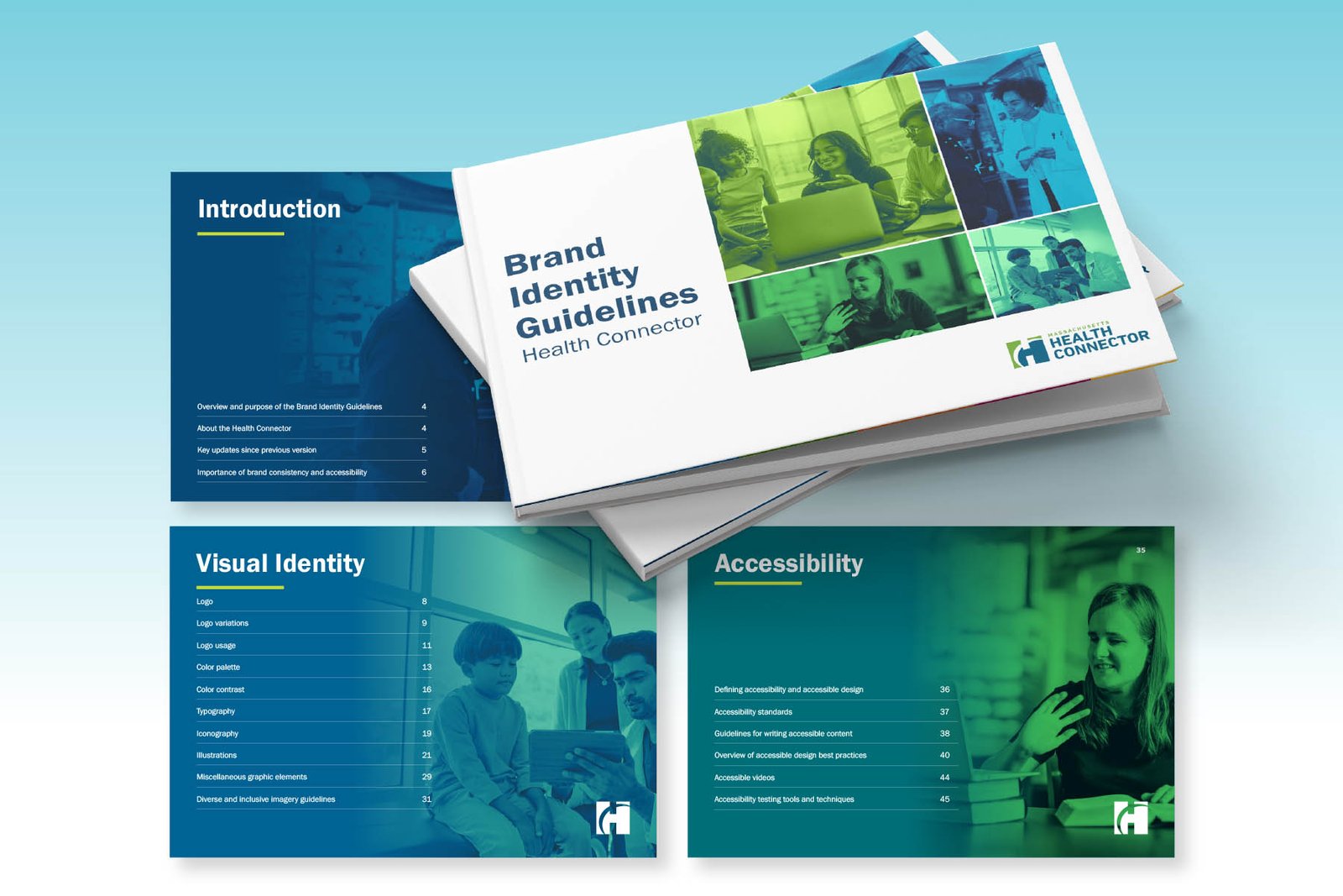
Massachusetts Health Connector needed a fully refreshed brand system to improve consistency, clarity, and inclusivity across all materials. Their communications had to work for everyone, across diverse communities and accessibility needs.
02 / The Shift
The Shift We Made
We overhauled the visual identity, building a brand system that improved readability, strengthened consistency, and centered inclusion throughout tone and design.
03 / The Work
How We Did It
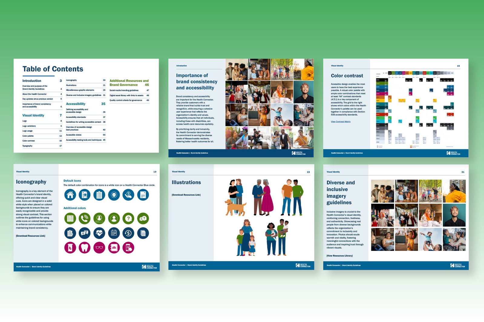
- Expanded the color palette with smarter, more accessible combinations, providing better readability and navigation for people with visual differences
- Added section markers and navigation aids to complex documents so dense content felt simpler and more approachable
- Created custom illustrations featuring diverse people and scenarios, making materials feel authentic and reflective of Massachusetts communities
- Delivered updated photography guidance prioritizing diverse, real-world imagery
- Developed ready-to-use, accessible Word and PowerPoint templates for internal teams and partner organizations
- Embedded accessibility into design choices ranging from typography to video guidance
04 / What Happened Next
What Happened Next
The refreshed system rolled out across Health Connector materials, giving the team a consistent foundation for future communications
Accessible Word and PowerPoint templates were adopted by internal teams and partner organizations
The work introduced accessibility as a core design practice for the team and established a baseline for future materials
05 / Why It Mattered
Why It Mattered
This project proved accessibility and equity are strategic foundations. Every decision supported the Health Connector’s goal to connect with and serve the people who rely on them.